Cinema Guide Ireland

BRIEF
Redesign an existing app
Improve and reimagine the UX
Create a hi-fidelity prototype
PROCESS
Problem Identification
The Cinema Guide Ireland app shows cinema listings, film reviews, trailers, news and schedules for all cinemas in Ireland.


Rated less than 2 stars on Apple’s App Store, primary research identified several problems with this app, ensuring plenty of scope to improve and add value to the current user experience:
Can’t book cinema tickets
No search function
Listings are non-alphabetical
Cinema location map is not interactive
Inconsistent star ratings
Inactive trailer button

Can’t book tickets
No search function

Cinema map is not interactive
Cinema name not displayed anywhere on the screen

Lists are non-alphabetical
‘Favourites’ is difficult to see
Images are distorted
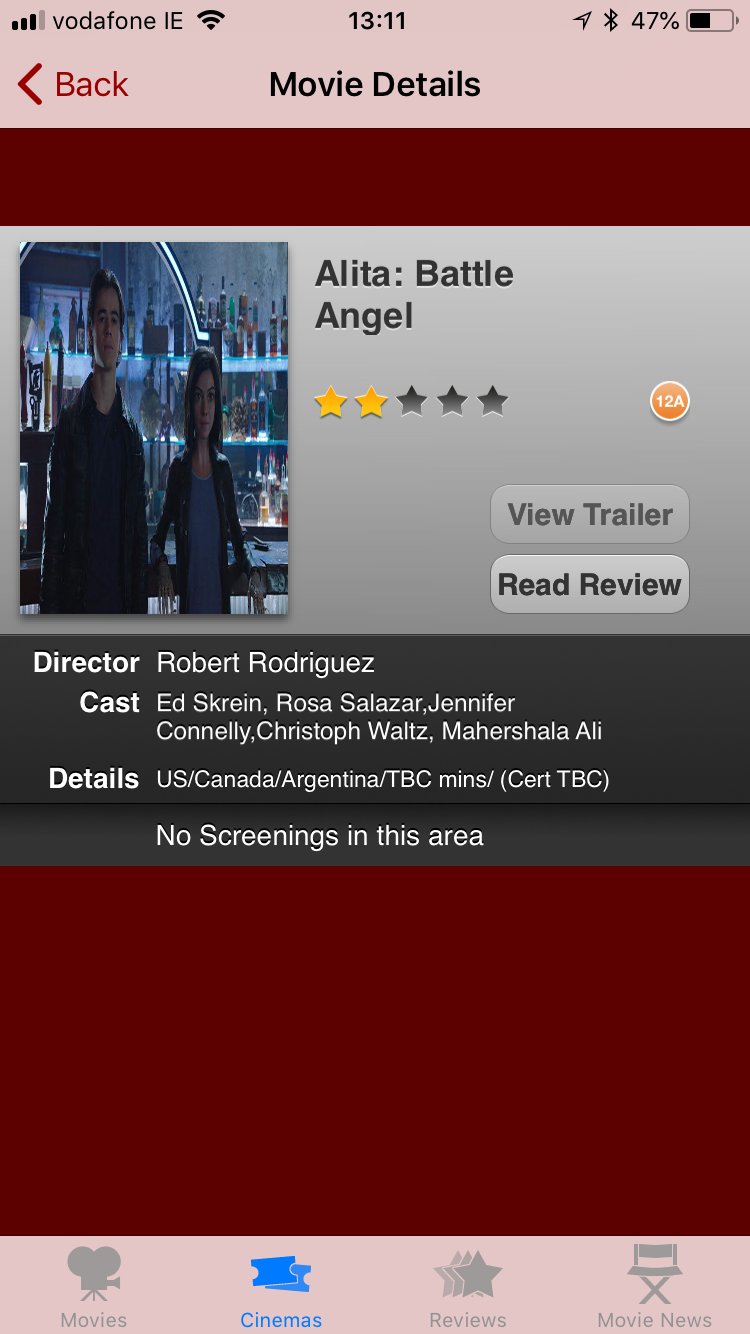
Inactive trailer button on every screen
‘No screenings in this area’ on every screen


Problem Statement
Inconsistent star ratings…is it 4.5 or 5 stars?
”View Trailer” button inactive throughout entire app
“I simply want to see what movies are on, choose one to see where it is on, and book a ticket.”
Primary Research
There is no right choice or combination of techniques for gathering project requirements (Preece, Sharp, & Rogers, 2015). Our primary research consisted of usability goals, UX goals, task models, heuristic evaluation, competitor and user review analyses.
Usability goal analysis revealed there were issues with effectiveness, efficiency, utility and safety, most notably the inability to book tickets, the lack of a search function, and the lack of location services.
Subjective assessment of user experience goals found the app frustrating, annoying and unpleasant to use. Could we make this enjoyable, entertaining, pleasant, engaging and fun?
Task models illustrated that while the web version has a booking feature, though poorly functioning, the mobile app is limited to timetables and reviews.
It is difficult to know how helpful user reviews really are according to a study revealed by Saito in 2017. User reviews found the App Store scoring 1.6 stars while Google’s Play store scored 3.5 stars. Nonetheless, certain issues were highlighted including the lack of a search feature, lack of reliable reviews, and a number of users commenting “What’s the point?”.
A competitor review analysis concluded that the majority featured booking and search features, location services, and movies ‘coming soon’.
Heuristic evaluation found 25 violations of accepted usability principles, scoring 88/100 on the severity rating scale. Issues comprised the inability to book a film through the app, no logical order to lists, and non-existent location services.
Secondary Research
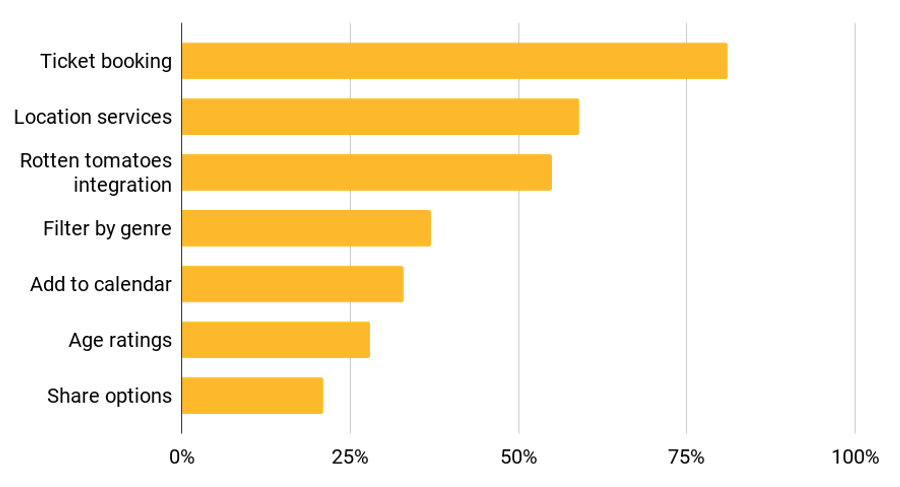
Quantitative data was gathered via an online survey sent to 220 targets. This returned 154 responses (70% response rate).
The key findings were that targets rated the following features as most important:
Ticket Booking (81%)
Cinema location, route & journey time (59%)
Rotten Tomatoes/IMDb integration (55%)
Open questions suggested respondents valued trailers, loyalty schemes and promotions.
Qualitative data was gathered via usability testing, one of the two most widely used research methods in UX (Rohrer, 2014). These are discussed in Report 4.
In conclusion, both primary and secondary research techniques conclusively validated the initial problems identified.
Personas
Proto-personas were created from primary research. Based on findings from the surveys and user testing, these were iterated to create our personas.


Empathy Maps
Empathy maps were created for both personas as a way of understanding them more deeply and prioritizing their needs.

Customer Journeys
Customer journey maps were created for each persona to visualise and identify the specific persona’s behaviours and pain points throughout the journey.


Project Plan
Thinking through all the logistics of the schedule which would need to be completed in a 12 week period, a list of requirements was compiled:
Usability/UX Goals
Competitor/user review analysis
Task models
Heuristic evaluation
Proto-personas x2
Define survey questions
Survey pilot test
Send survey
Usability testing
Analyse research results
Personas x2
Empathy maps x2
As-is scenario & customer journey x2
To-be scenario & storyboards x2
It was important to keep track of the many activities and documents generated in the project, and also to be able to share and edit the plan in real time as a living document. Collaboration in the cloud was important and we used two tools where this was possible.
Dropbox Paper enabled us to share a common checklist of the many different user experience design activities we would need to complete, allowing us to check them off as they were completed.
An online gantt chart tool, TeamGantt, allowed us to create a real-time visual schedule to illustrate each activity on a timeline, showing the dependency relationships between elements where they exist. This helped us to remember what to do, when to do it and to keep track throughout the process.

Information gathered such as data captured, scripts, documents, forms and recordings were shared and stored by various means including Slack and Dropbox.
Certain activities took less time than anticipated while others took longer, e.g. the online survey was sent out 24 hours later than planned. Where these instances occurred the timeline would be amended and any dependent elements would be adjusted automatically.
Roles
With the exception of Project Manager which I assumed at the outset, all team members contributed to the many roles ordinarily undertaken individually in a UX team, namely:
User Research
Usability Testing
Content Strategy
Information Architecture
Interaction Design
User Interface Design
Visual Design
(“Project Team Roles and Responsibilities | Usability.gov,” n.d.)
Milestones
Sending out the online survey by the middle of week 3 was seen as a significant milestone as it signified the completion of primary research which would allow us to now focus on usability testing while waiting on survey results to come back.
Other milestones would include the completion of an interactive wireframe prototype, with the most notable being the fulfilment of a hi-fidelity version ready for testing.
Context Review Research
Research was carried out on a broad range of products from competitors to applications containing some of the functions we were trying to emulate.


Netflix illustrated how it would look to utilise a contrasting interface for kids programmes.


Citymapper has a pleasing and fully functioning interactive map, while Pinterest uses a simple yet intuitive search field.


UI Library
Moleskine’s Timepage app contains lists and colourways both appealing and relevant, while Trivago was useful to explore as an aggregator product.

This project from a Dribbble portfolio contained an exciting and relevant colour palette.
Visual Design
A design system library was created, with design patterns, such as colors, text styles, assets and components to build a quality consistent prototype.

Colour palette
Typography
Gibson is the font used.


Image Styles


Layout

Iterative Design Process
Ideation through crazy eights and subsequent sketches provided the core of the design.
Balsamiq was used to create a wireframe prototype, which was tested and iterated before progressing to a hi-fidelity prototype created in Adobe XD.
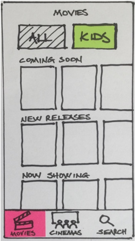
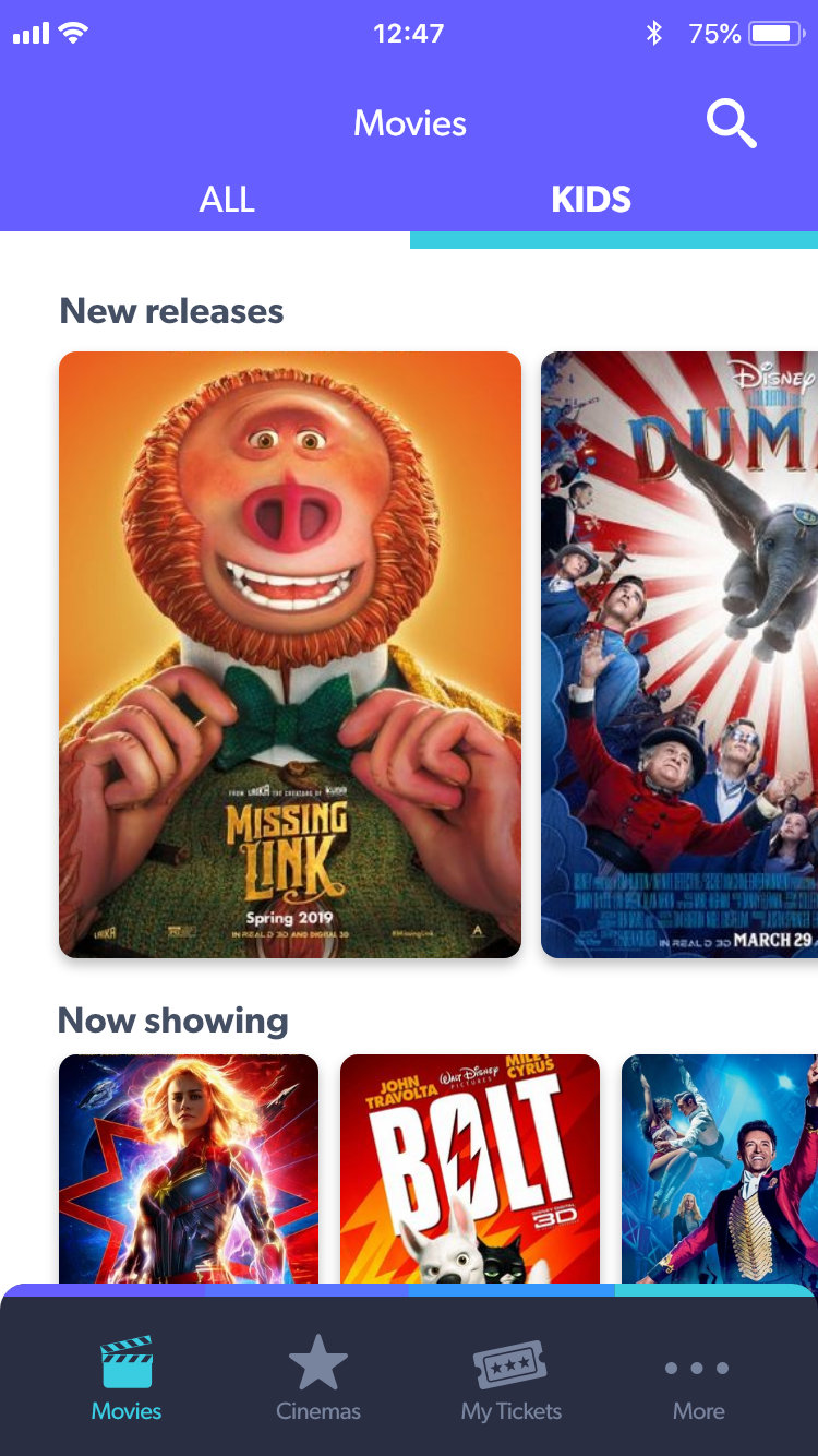
Development of screens for ‘All’ and ‘Kids’ movies
Crazy 8s


Following initial testing, wireframe features a booking facility

Development of ‘ALL’ and ‘KIDS’ screens


Cinema and users’ relative locations
Usability Test 2 - Wireframe
Using the same process as the original tests, usability tests were conducted on the initial wireframe. These highlighted certain issues, producing these iterations:
Planned Hi-Fidelity Iterations
Usability tests were carried out on the hi-fidelity prototype. Below are some of the issues encountered which would have been resolved in future iterations had time allowed.
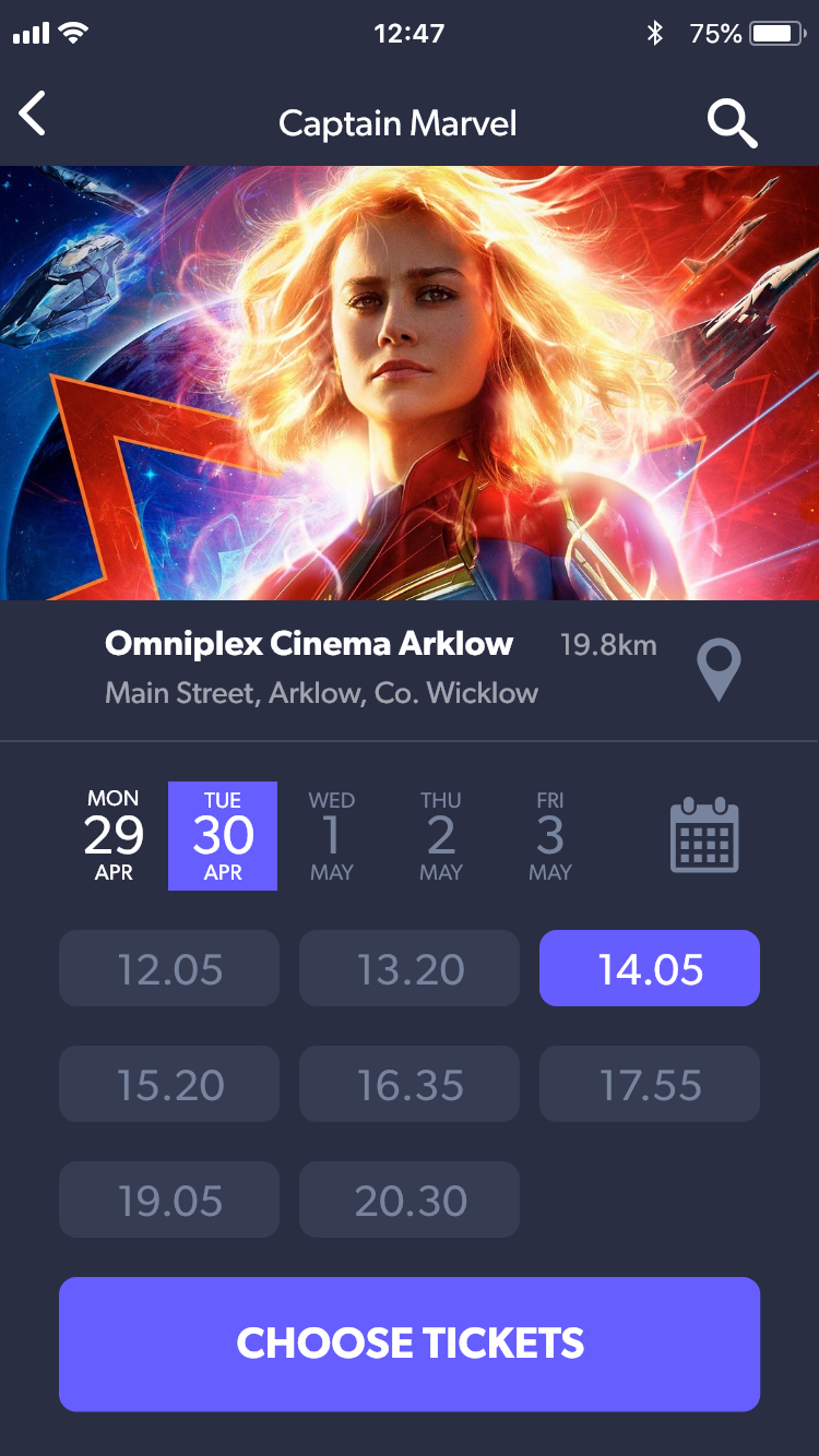
Movie times and dates

Cinema listings


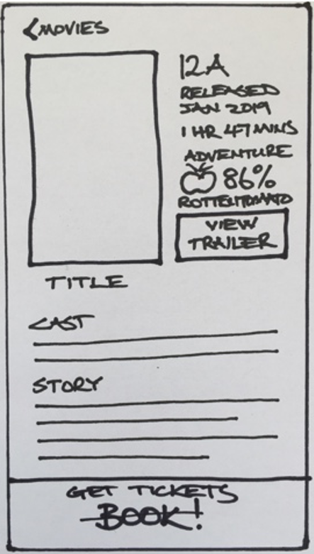
Movie details & trailers


From original app to hi-fidelity prototype


Home screen features a tab bar for navigation, search icon and a ‘KIDS’ button with UI contrast
First Wireframe Iteration
Delivered
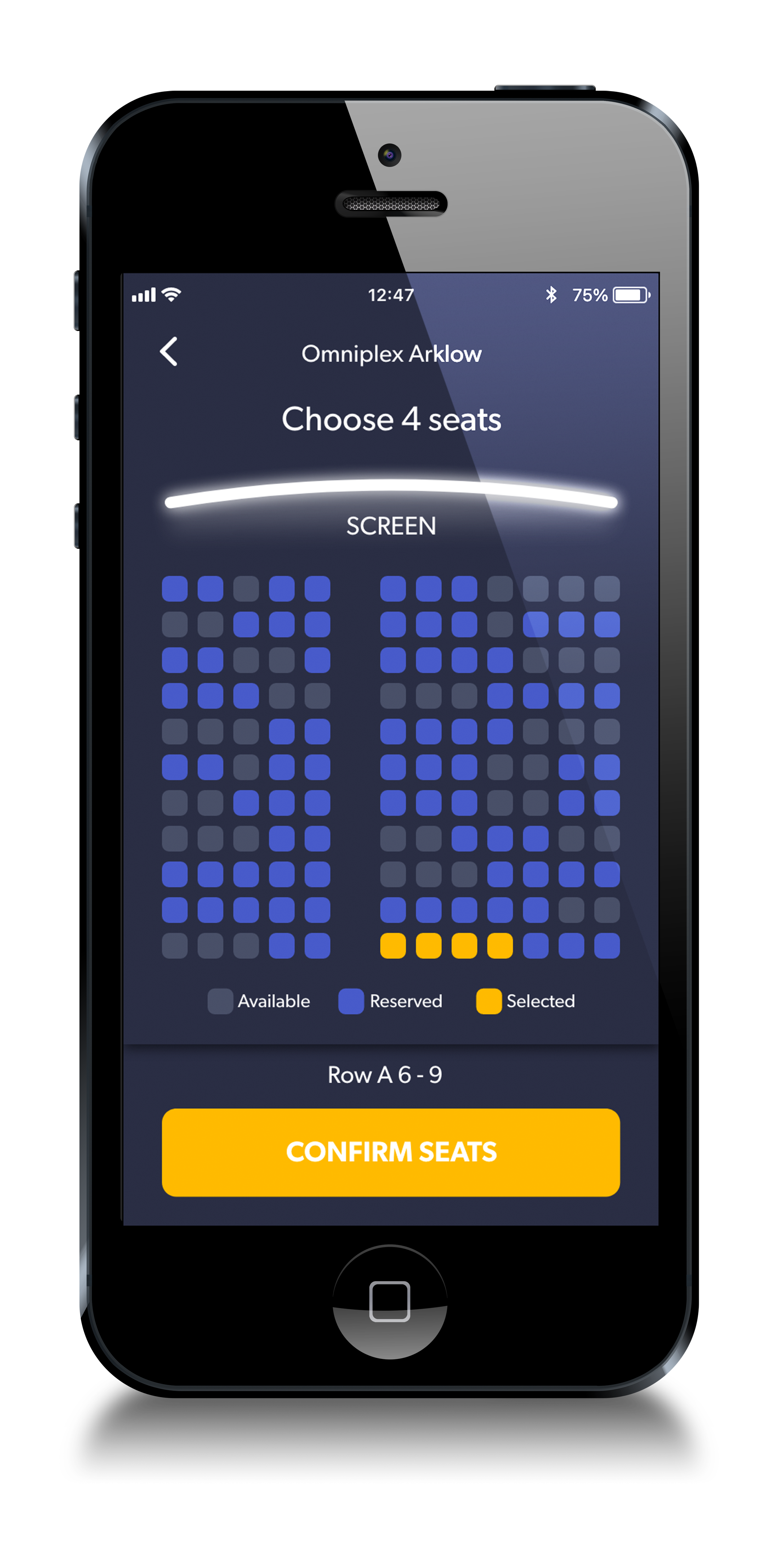
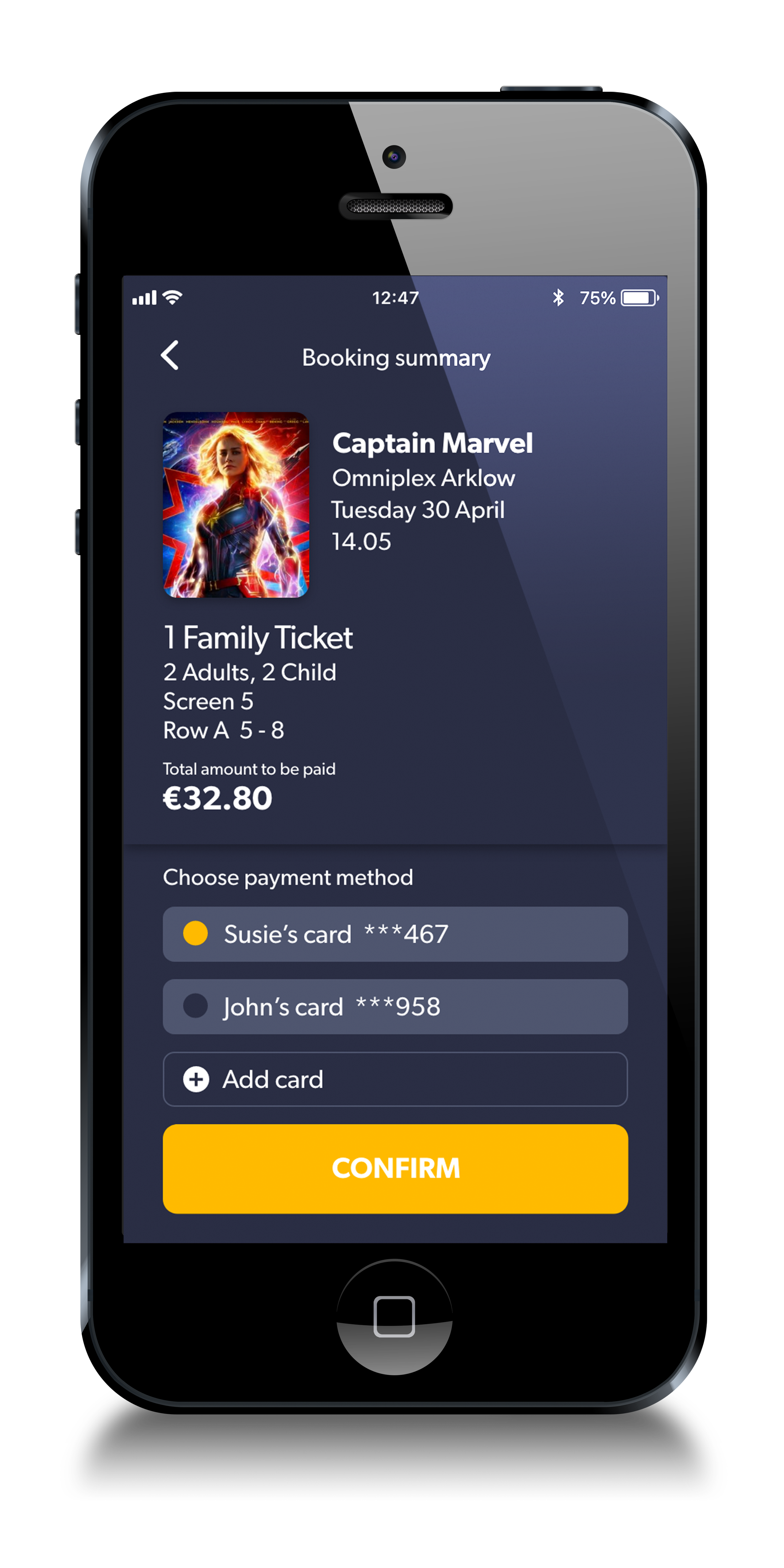
Hi-Fidelity prototype designed to complete one specific customer journey:
Susie’s credit card CVV is 123. Buy a family ticket to the kid’s movie Captain Marvel showing at the Omniplex Cinema Arklow on Tuesday 30 April around 2pm.
Try complete the task here
Here are some screenshots:
IXD Principles & Patterns
Assessment against the Five Dimensions of Interaction Design (2016):
The wording used in the prototype is designed for clear communication and is very simple to understand e.g. All, Kids, Story, Choose tickets, Book tickets.
Visual consistency exists throughout the prototype with the use of a common layout grid, button styles, typography and a colour palette. A tab bar appears on most screens and is a pattern to provide clear navigation. Other patterns include list formats and CTA buttons.
The prototype follows conventional standards in terms of interactive target areas, placement of interactive elements and common gestures.
There is a clear and efficient journey from launch to receiving a digital ticket. As a prototype not reliant on server speeds, the time factor is probably less of an issue. However, ideas for loader screens were implemented for future iterations and included animated popcorn scenes and movie quotes.
User testing suggested that users had more positive emotions when interacting with the prototype compared to the original application.
Assessment against The 5 Pillars of UXD (Cao, 2015)
Personas, user stories and experience maps were created to better understand the goals.
The prototype allows the user view information and to book tickets with minimum effort.
Round edged buttons as signifiers clearly let the user know they were interactive, however testing revealed certain interactive elements provided little affordance and this would need to be addressed in any following iteration.
Consistency is a feature throughout, thus helping learnability.
As a team we are striving to design our app to be friendly, interesting, and helpful.

Usability Test 1 - Original App
Participants were identified to test the entertainment.ie cinema app based on proto-personas developed during the primary research phase. 6 participants were selected approximating the 5 users recommended by Neilsen in 2000.
A consent form was presented for participants to sign, and a test script was given describing various tasks to be undertaken. Users were recorded and were asked to think aloud. After the testing users were probed on their actions and behaviours.
The team wanted to observe the user attempting to book tickets to see if they wanted this feature, although we knew there was no way to do this. Testing confirmed this to be the case.
Users found that checking movie times for the same movie in their two closest cinemas was difficult, as it involved going in and out of separate expandable lists, relying on recall over recognition to remember information.
Testing also made it clear that a search feature was important, and that finding kid’s movies should be made easier. Users were unable with any degree of confidence to find the distance and route between the train station and a cinema in Carlow, expressing a desire for improvement regarding location services.
In conclusion, many of the identified problems would be easy to solve, such as alphabetical listings, giving a trailer button functionality and eliminating inconsistencies with star ratings. The team’s attention now focused on redesigning the primary functions of the app - selecting a movie and booking tickets easily.
Ideation & sketch flow
Wireframe prototype
Test
Wireframe iterate
Hi-fidelity prototype
Test & iterate